
Francesca Mellin is the Head Librarian at The Pike School in Andover, MA
This is Fran's last column (until she moonlights for us as a guest columnist!). We are so thankful that Fran has given so much of her time and talent to make the Picture Book Column such a wonderful addition to the Forum.
It feels like the recent— and highly anticipated— explosion of spring color is more intense than usual this year. The many hues of green bursting on tree branches and the striking contrast of pink dogwood blossoms against a deep blue sky awaken our senses. I’ve found myself more highly attuned to the role of color while going about my library routines: selecting books for Poetry Month displays, choosing a read-aloud, or getting lost in the wonder of unpacking new books. Let’s reflect on how color is used to enhance storytelling.
Color is the first of the five basic elements of art, the others being line, shape, form, and texture. When we evaluate and appreciate picture book illustrations, we’re often synthesizing how artists combine these elements. This spring, though, I went on a bit of a quest in search of books where color was a dominant and distinct element, playing a key role in advancing plot, enhancing emotion, or developing theme. As part of this quirky investigation, I decided to eliminate books whose overt theme was color itself. I reluctantly passed over Laura Vaccaro Seeger’s excellent series, Green, Blue, and Red, as well as many other staples in the more direct color-book realm. What follows is a decidedly eclectic collection of titles, linked by distinctive color elements.
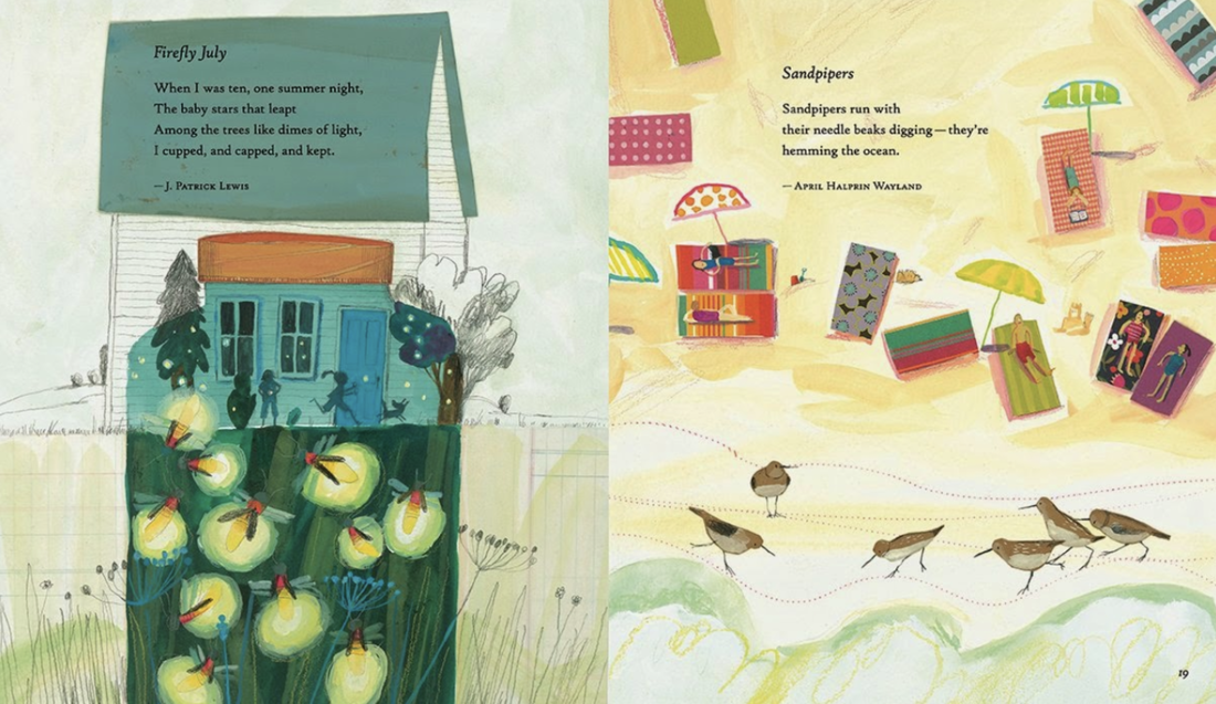
While choosing titles for April’s poetry month display, I became intrigued by the constraints and opportunities for artists who have illustrated poetry collections. In the 2018 title Seeing Into Tomorrow by Richard Wright, Nina Crews’ photographs capture the deep blues and lush greens of a spring day, assembled in Cubist-style collages that not only support the impressionist quality of the haiku form, but also evoke spontaneity of thought. The colors of the typeface extend the hues of each poem. Melissa Sweet uses her riotous mixed media color palette to excellent effect throughout the 2014 season-based anthology, Firefly July: A Year of Very Short Poems, selected by Paul Janeczko. She is careful to balance pops of color (“The Red Wheelbarrow”) with lush earthy tones. She effectively creates visual balance and color continuity across the page, while also creating interconnected scenes that serve as a backdrop for multiple poems.
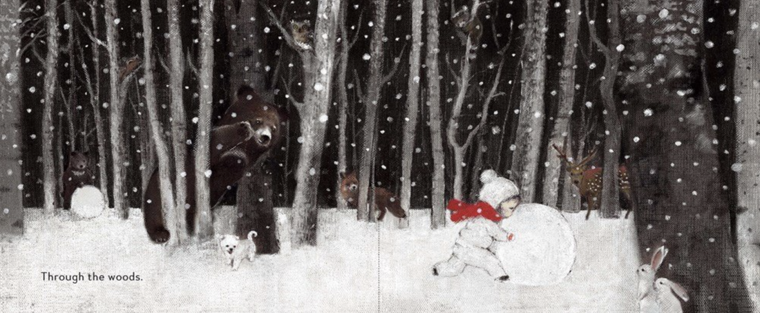
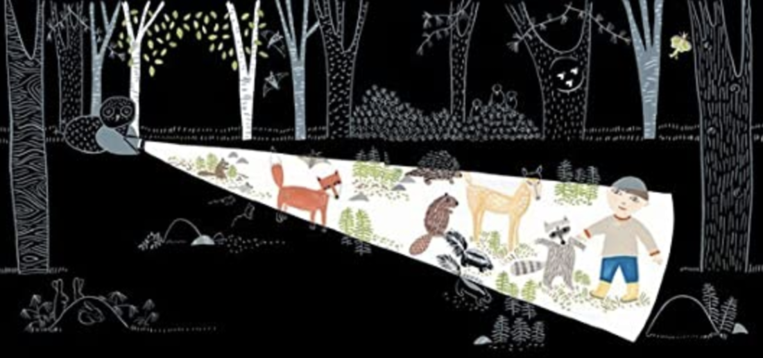
I’ve always admired how artists bring nighttime stories to life in all seasons, leveraging subtle differences in hues to create depth. Bomi Park’s 2016 debut First Snow features a wakeful girl who embarks on a midnight adventure. The woodland animals, while camouflaged, come into view through careful color shifts. Without the benefit of moonlight, gradations of charcoal, sepia, gray, and white combine to create a winter wonderland. A similar summertime plot is explored in Lizi Boyd’s delightful 2014 title, Flashlight. Against a flat black background, the white beam of the child’s flashlight reveals mice eating red ripe strawberries, soft green ferns, and much more. Adding to the fun are Boyd’s trademark die-cuts, which invite the reader to discover more nighttime creatures and follow the rising full moon.


The possibilities within a limited color palette are also intriguing. In Joseph Kuefler’s 2013 The Digger and the Flower, the yellow digger stands out against the black and gray city, highlighting the character’s caring as he protects a fragile blue flower. As he ventures beyond his drab urban environment on a rescue mission, he encounters lush, textured green hills, signaling hope to the reader. For the woodland environment in Katherena Vermette’s 2019 title, The Girl and the Wolf, illustrator Julie Flett (Cree-Métis) sticks to earth tones silhouetted against a pale sky. This backdrop allows the unnamed girl, clad in a red dress and moccasins, to claim our attention as she navigates the uncertainty of being lost in the woods, coming to rely on the sage advice of a helpful (yes, helpful) wolf.

The muted tones and color palettes of these two titles serve different purposes to equally fine effect. What Feelings Do When No One’s Looking, the 2022 title by Tina Oziewicz, translated from the Polish by Jennifer Croft, is our faculty’s newest favorite picture book. Each page shows an emotion brought to life (“Calm pets a dog”) personified by Moomin-esque creatures created by illustrator Aleksandra Zając. The gentle blues, reds, pinks, and grays used throughout provide a continuous validation of all emotions, while a burnt orange string connects and contrasts hate and love. Color itself is a metaphor for love and generosity in Mac Barnett’s Extra Yarn, the 2013 Caldecott Honor book illustrated by Jon Klassen. Set in a bleak, wintery town, the colorful yarn that Annabelle discovers gradually envelopes people, pets, and buildings, transforming her community. Klassen keeps the shades of this multicolored yarn subdued, which gives the story a sophisticated feel and adds to the story’s timeless quality.

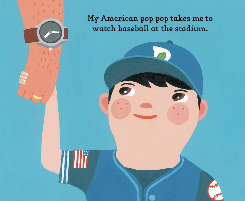
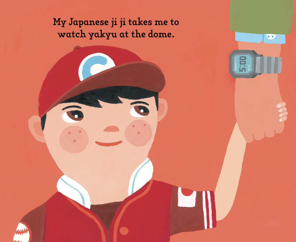
High color contrast can enhance key concepts in picture books. In Julia Denos’ 2017 Windows, illustrator E.B. Goodale elevates the experience of a child’s twilight neighborhood walk by silhouetting the neighborhood against a glorious, rich sunset. As night falls, house interiors are illuminated by hues of warm yellow, allowing the child and the reader glimpses into this diverse community. The complementary endpapers underscore this journey, depicting the exact same view first in late afternoon, then at moonrise. Color also plays a key role in supporting the contrast between cultural practices in Aaron Meshon’s 2013 Take Me Out to the Yakyu. Vibrant blue and red backgrounds anchor the child’s description of American and Japanese baseball outings, with details like memorabilia and clothing following suit.

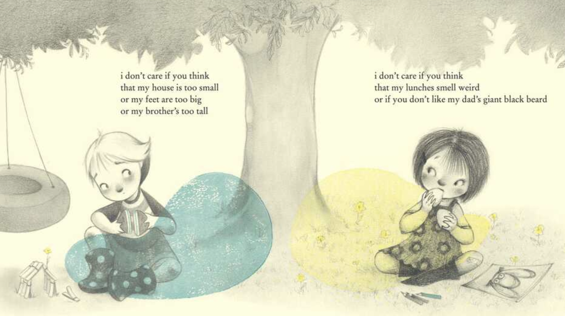
How artists separate or blend color is one of the most impactful ways they can amplify emotion and emphasize theme. In Erin Hourigan’s 2023 Schneider Honor book, In the Blue, the toll that depression takes on a family is examined. The father is shown against a range of blue hues as he works through extreme sadness (deep blue), rage (blue-red), to arrive at contentment (yellow-blue). These last two colors are the centerpiece of Julie Fogliano’s 2022 I Don’t Care, illustrated by Molly Idle and Juana Martinez-Neal. Each of the two girls in this friendship story is identified with blue or yellow. At the outset, they’re not getting along (“I really don’t care what you think of my boots”) and are positioned on opposite sides of the page with “their” color. However, as they start to miss each other, not only does the refrain shift meaning (“I don’t care at all if your house is too tall”), the isolated colors begin to bleed across the gutter and - you guessed it - blend, so when the girls are reunited on the same side of the page, the color green appears and smiles ensue.
So there you have it, the results of my unconventional exploration of challenges, opportunities, and techniques that artists engage with in service of distinctive visual storytelling. I’m sure you’ve thought of at least another dozen titles just while reading this article— after all, it’s what we librarians do, isn’t it? Share your ideas in the comments!
So there you have it, the results of my unconventional exploration of challenges, opportunities, and techniques that artists engage with in service of distinctive visual storytelling. I’m sure you’ve thought of at least another dozen titles just while reading this article— after all, it’s what we librarians do, isn’t it? Share your ideas in the comments!
